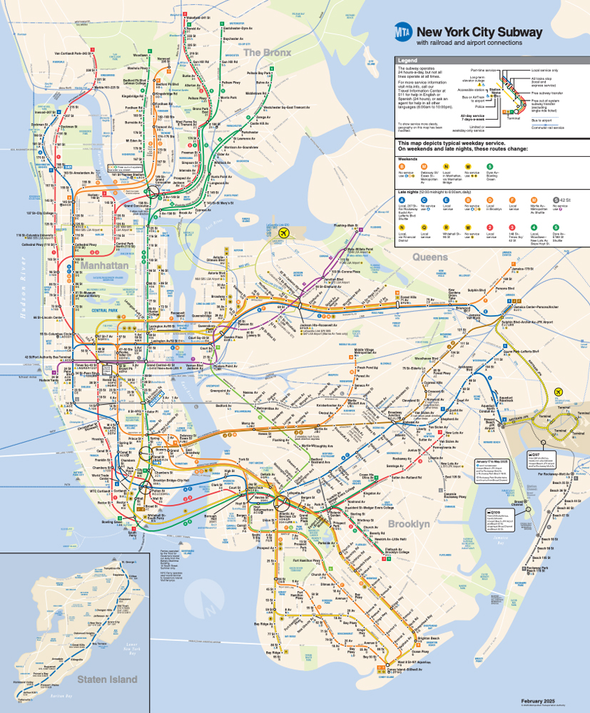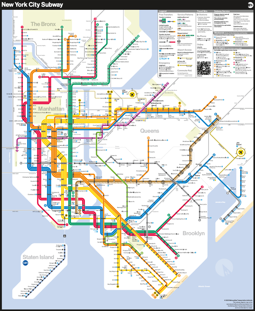
NEW YORK — The Metropolitan Transportation Authority has unveiled a redesigned version of its subway map, an instantly recognizable symbol of New York City and its transportation.
The new design, the first since 1979, offers a more stylized, diagrammatic style than the more geographically accurate current version. The MTA says the white background, bold colors, horizontal lettering and use of black dots is intended to make the map more ADA-friendly and easier to read for those with vision issues or cognitive disabilities.
“The subway map is both an iconic symbol of New York and a tool that everyday riders and first-time users of our system use to get around,” New York City Transit President Demetrius Crichlow said in a press release. “This modern redesign makes it easier to navigate the system – especially during service changes – and has a quintessential New York look that riders will appreciate for years to come.”
The new map includes a QR code to lead users to the MTA website, as well as a more detailed legend including accessibility, transfer, and safety information. It retains the color-coding for lines introduced with the 1979 map, while its schematic design draws from a map introduced in 1972.
The new map is already displayed on digital station screens and will soon be onboard the R211 subway cars, the system’s newest. Both the old and new maps will be available on the MTA website.